
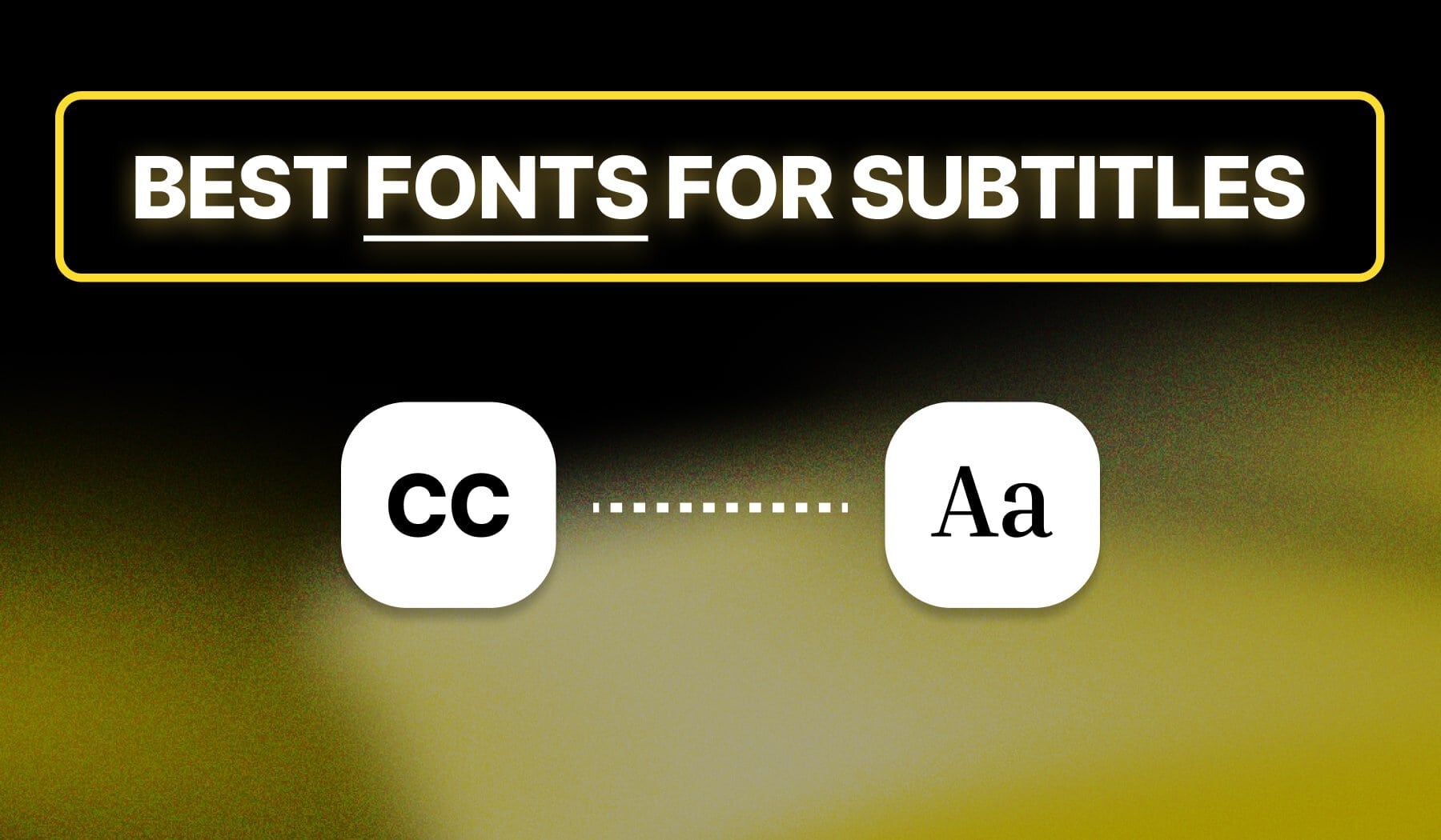
Fonts for Subtitles & Captions

If you’re on this page, I believe you already know how important subtitles are.
The search for the best font is over. In this guide, I’m taking you through our expert team’s curated list of the 9 best fonts for subtitles and captions.
Won’t waste your time. Let’s go!

9 Best Fonts for Subtitles (and Captions)
The best fonts for subtitles and captions include top picks such as Arial, Verdana, Helvetica, and 6 more!
Join me as we I through each option.
1. Arial
Arial is a widely used sans-serif font known for its clean lines and readability. It’s an excellent choice for subtitles due to its versatility and familiarity across various platforms.
Get the font: Arial on Font.Download
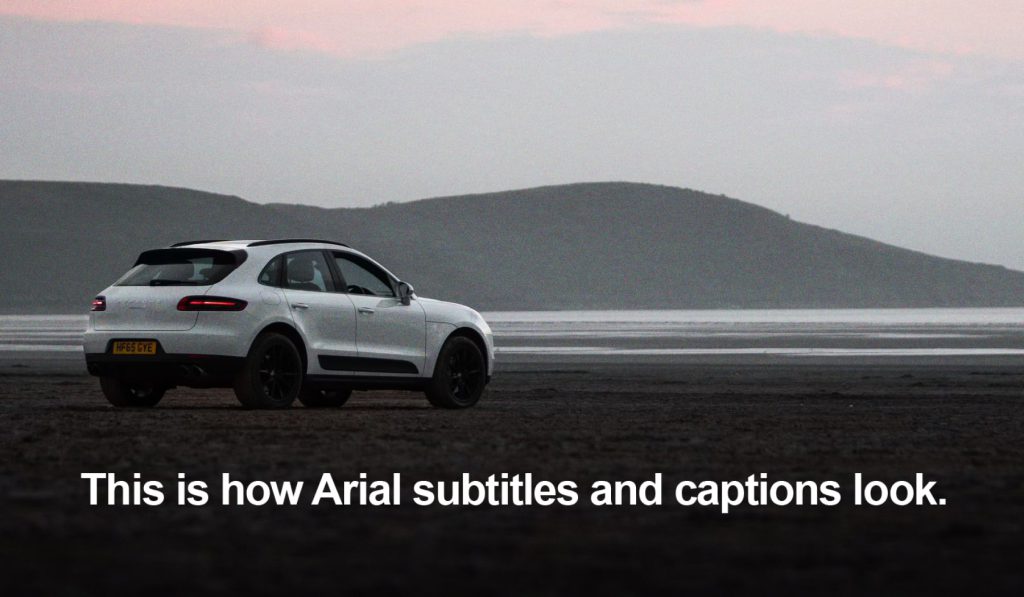
Its simplicity allows it to blend seamlessly with any visual content, making it easily legible even at smaller sizes. This makes Arial a reliable option for any video or presentation needing subtitles.
2. Verdana
Verdana was specifically designed for screen display, offering excellent legibility in digital formats.
Its wide spacing and large x-height ensure that viewers can read subtitles quickly and effortlessly.
Get the font: Verdana on DaFont

This font’s modern feel makes it suitable for a variety of video genres, from professional tutorials to casual vlogs. Verdana’s clarity makes it a popular choice for subtitles that need to capture audience attention without distraction.
3. Helvetica
Helvetica is a classic sans-serif font celebrated for its timeless elegance and versatility. It provides a professional appearance, making it perfect for corporate or educational videos.
Get the font: Helvetica on Font.Download
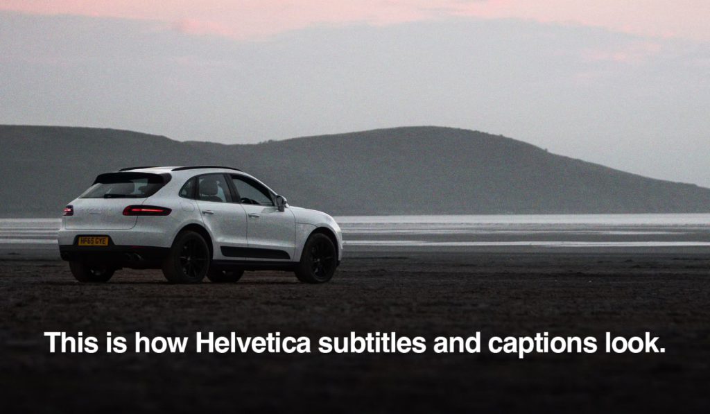
With its clean lines and uniform spacing, Helvetica enhances readability, ensuring viewers can easily follow along with the subtitles. This font is a go-to for many designers, given its modern aesthetic and broad appeal.
4. Roboto
Roboto is a contemporary sans-serif font that balances geometric forms with friendly curves. Its readability at various sizes makes it ideal for subtitles in both informative and creative content.
Ge the font: Roboto on Google Fonts

Additionally, Roboto’s wide range of weights allows for creative emphasis, giving content creators flexibility in how they present information. This versatility makes it a favorite in modern video production.
5. Futura
Futura is a geometric sans-serif typeface known for its clean and modern appearance. It stands out well in subtitles, providing a strong presence on screen without being overpowering.
Get the font: Futura PT on Adobe Fonts
The font’s unique shapes and sharp angles contribute to a distinctive look, making it suitable for artistic or avant-garde videos. Futura effectively combines style and clarity, capturing viewers’ attention.
6. Open Sans
Open Sans is a humanist sans-serif font designed with an emphasis on legibility. It offers a neutral yet friendly tone, making it suitable for a wide range of video content.
Get the font: Open Sans on Google Fonts

This font performs well in various sizes, ensuring that subtitles remain clear and accessible. Its clean design also allows it to complement a variety of visual styles seamlessly.
7. Times New Roman
Times New Roman is a traditional serif font known for its formal appearance. While commonly used in print, it can also lend a sense of authority to video subtitles.
Get the font: Times New Roman on MyFonts
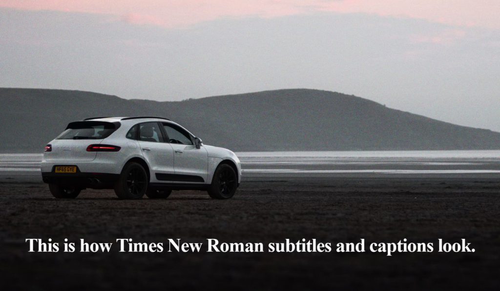
This font is best suited for educational or serious content, where a classic touch enhances credibility. Its readability ensures that subtitles remain effective, even in longer passages.
8. Georgia
Georgia is another serif font designed specifically for screen readability. Its larger-than-average letters and unique style make it an excellent choice for subtitles in various video formats.
Get the font: Georgia on Font.Download

This font strikes a balance between elegance and practicality, enhancing the viewing experience without drawing too much attention. Georgia’s warm and inviting appearance helps create a connection with the audience.
9. Bebas Neue
Bebas Neue is an all-caps sans-serif font known for its bold and impactful appearance. It’s perfect for titles and subtitles that need to grab the audience’s attention quickly.
Get the font: Bebas Neue on Google Fonts

This font’s strong lines and minimalistic style make it a favorite for promotional videos and dynamic content. Bebas Neue ensures that subtitles remain striking while effectively conveying the message.
Why SendShort is the best app for captions
SendShort is a the #1 AI tool designed to streamline the video editing process, including subtitle creation.
With its user-friendly interface, you can easily add, customize, and format subtitles using a variety of fonts, ensuring that your content is not only engaging but also accessible to a wider audience.
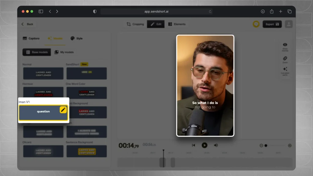
Whether you’re looking to use popular fonts like Arial or modern options like Montserrat, SendShort provides flexibility in design. This allows you to create visually appealing subtitles that complement your video style, ensuring clarity and enhancing viewer experience.
Plus, with features that support easy editing and formatting, you can quickly adapt subtitles to fit any project, making SendShort an essential resource for content creators.
How to Choose a Font for Subtitles
| Video Type | Sans-Serif Options | Serif Options |
|---|---|---|
| Explainer/Educational | Roboto, Open Sans, Lato, Verdana, Tahoma, Quicksand | Times, Georgia, Lora |
| Corporate/Formal | Helvetica, Arial, Roboto | Times, Georgia, Lora |
| Gaming/Entertainment | Lato, Poppins, Rubik, Montserrat, Quicksand | Arvo |
| Modern/Minimalist | Roboto, Open Sans, Lato, Poppins, Rubik, Montserrat, Josefin Sans | Arvo |
| Creative/Artistic | Lato, Poppins, Rubik, Montserrat, Josefin Sans, Cabin, Quicksand | Arvo, Lora |
But let’s break down the best deciding factors.
1. Readability
Choose a simple, clean font that’s easy to read on various screen sizes. Sans-serif fonts like Arial or Helvetica work well for subtitles.
2. Font Size
Ensure the font size is large enough to read comfortably without covering too much of the video content.
3. Contrast with Background
The font color should contrast well with the video background. Adding a shadow or outline can help maintain readability on busy scenes.
4. Consistency with Brand or Tone
If you have a brand style, pick a font that matches its tone. For a professional look, go for a clean, modern font; for a playful style, something slightly rounded might fit.
5. Subtitle Placement
Keep subtitles centered and slightly above the bottom edge of the screen to ensure they’re easily visible without disrupting the video’s visual focus.
6. Subtle Styling Choices
Bold, italics, or slight color adjustments can add emphasis without making the text distracting.
Avoid overly stylized fonts for clarity.
These considerations help create clear, accessible subtitles that enhance viewer experience without overpowering the content.
Best Fonts for Various Video Types
1. Professional & Educational Videos
- Fonts: Arial, Helvetica, Roboto
- Why: These fonts are clean and easy to read, conveying professionalism and clarity.
2. Casual or Vlog Content
- Fonts: Montserrat, Lato, Open Sans
- Why: These rounded, modern fonts feel friendly and approachable, perfect for casual content.
3. Creative & Artistic Videos
- Fonts: Bebas Neue, Futura, Raleway
- Why: These fonts have a unique and stylized look that complements creative or aesthetic-driven content.
4. Social Media & Engaging Content
- Fonts: Impact, Anton, Oswald
- Why: Bold and eye-catching, these fonts help capture attention quickly, ideal for short, fast-paced videos.
5. Documentary & Informative Content
- Fonts: Times New Roman, Georgia, PT Serif
- Why: Serif fonts add a sense of formality and are great for informative or historical themes.
6. Playful or Humorous Videos
- Fonts: Comic Sans, Poppins, Nunito
- Why: These fonts feel playful and light-hearted, aligning well with humorous or kid-friendly content.
Using fonts that fit the tone of your video type can enhance viewer experience and reinforce your message effectively.
Frequently Asked
1. What font is used in Netflix subtitles?
Answer: Arial.
Netflix subtitles use the font Arial for its clarity and readability. In some cases, they also use Roboto, which enhances legibility on various screen sizes.
2. What is the best font for closed captions?
Answer: The best font for closed captions is Arial due to its simplicity and high readability across various devices. Other great options include Verdana and Open Sans, which also offer excellent legibility in smaller sizes.
3. What is the best font for open captions?
Answer: The best font for open captions is Helvetica, known for its clean lines and modern appearance.
Fonts like Roboto and Montserrat are also excellent choices, as they provide strong visibility and clarity against diverse backgrounds.
4. Where can I find the mock picture you’ve used?
Answer: Credits to the picture go to Paolo Resteghini on Unsplash.
Thanks a lot for reading this,
David Ch
Head of the Editing Team at SendShort
About the author
Daniel is the head of our research and statistics team. With Daniel's help, our team keeps up with the latest stats and financials for your favourite social media company.