Choosing the right font for your YouTube Shorts can significantly impact viewer engagement. By selecting fonts that are not only aesthetically pleasing but also readable, you can enhance the overall viewer experience.
This is the ultimate list of fonts for YouTube Shorts.

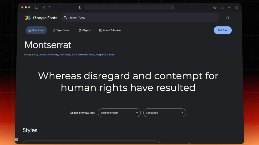
Get it: Montserrat on Google Fonts.
Montserrat is a modern sans-serif font that has gained popularity for its clean and geometric lines. It’s perfect for YouTube Shorts because it ensures that your text stands out against the video background.
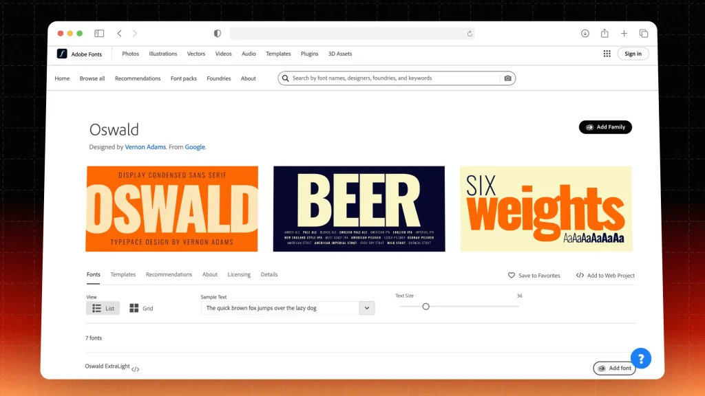
Get it: Oswald on Adobe Fonts.
Oswald is a condensed sans-serif font that is bold and impactful. Its unique character shapes make it a standout choice for headers.
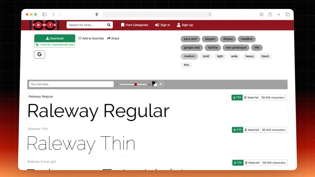
Get it: Raleway on 1001 Fonts.
Raleway is an elegant sans-serif typeface that provides a touch of sophistication. Its versatility makes it a great choice for YouTube Shorts that aim for a polished look.
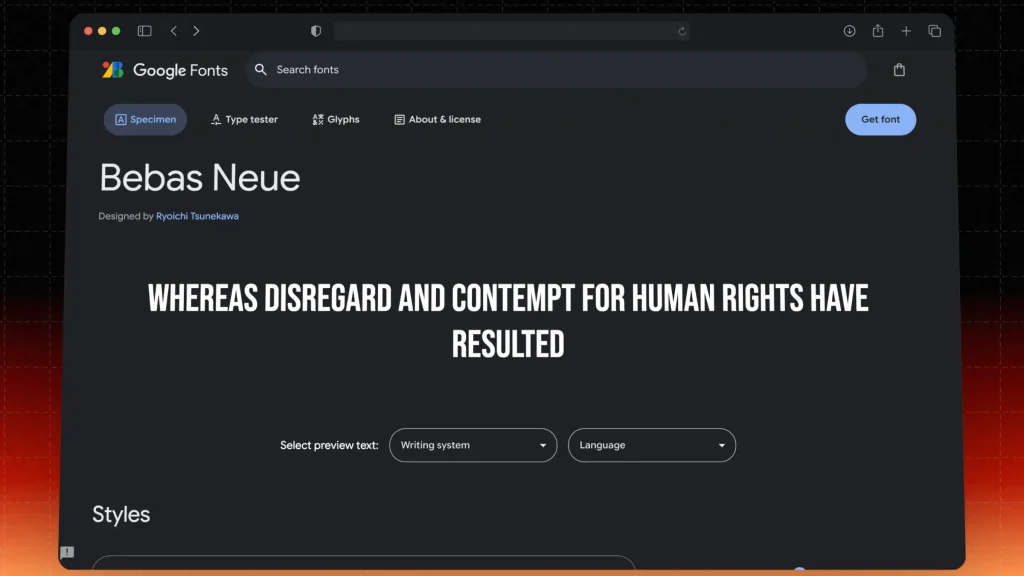
Get it: Bebas Neue on Google Fonts.
Bebas Neue is known for its tall and bold letters, making it highly effective for creating impact. This font is widely used in graphic design and works exceptionally well in short videos.
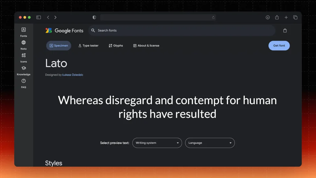
Get it: Lato on Google Fonts.
Lato is a versatile sans-serif font that balances modernity and warmth. Its legibility makes it suitable for both headings and body text in YouTube Shorts.
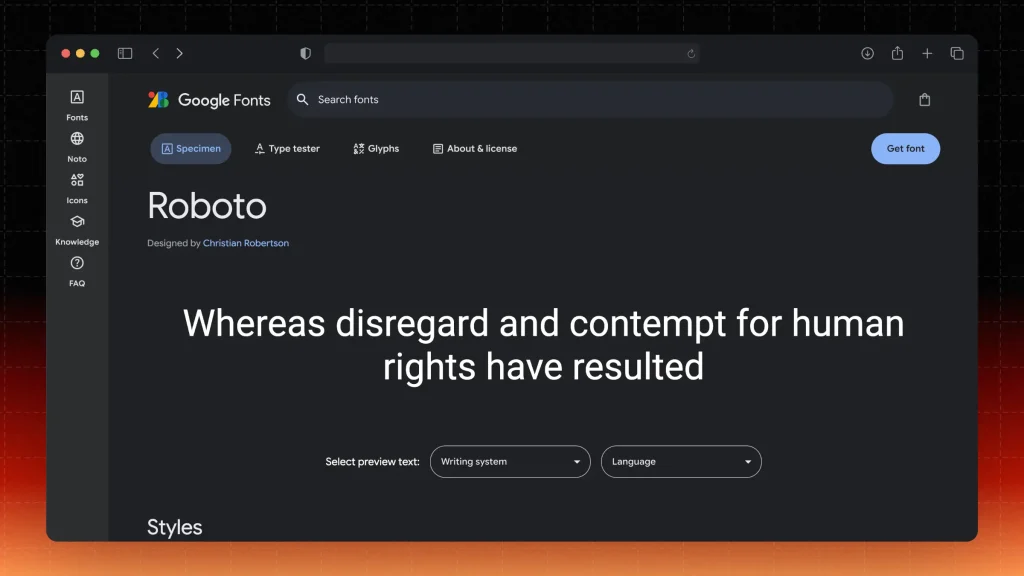
Get it: Roboto on Google Fonts.
Roboto is a geometric sans-serif font designed for optimal readability. It combines a modern feel with a touch of friendliness, making it a fantastic option for video content.
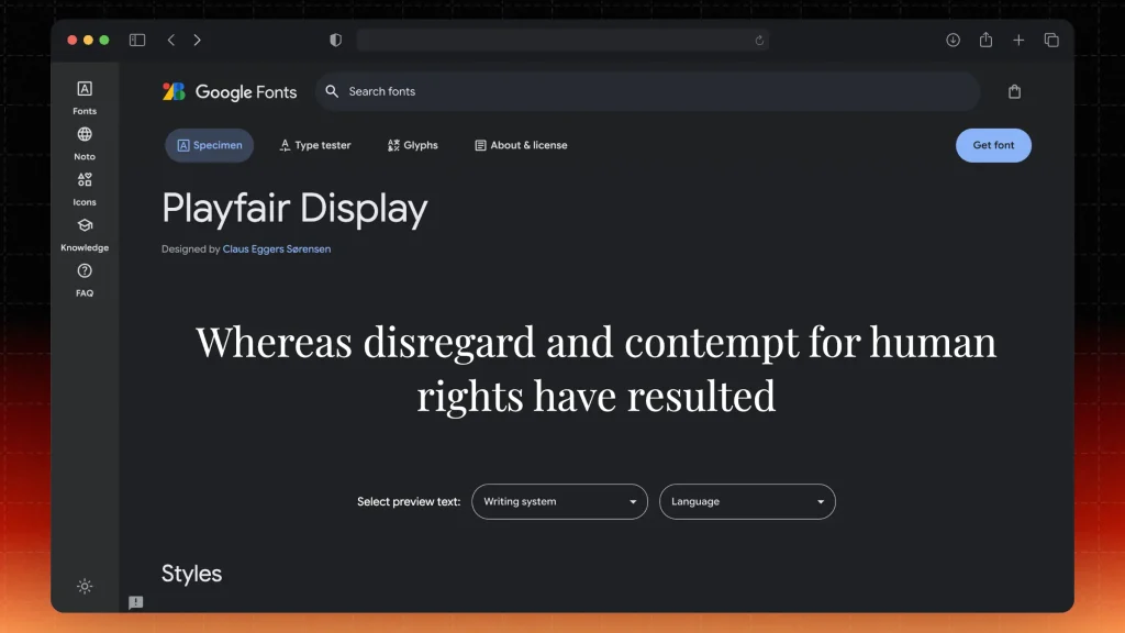
Get it: Playfair Display on Google Fonts.
Playfair Display is a serif font that adds a touch of elegance and sophistication to your YouTube Shorts. It is particularly effective for text that aims to evoke emotion or storytelling.
The right font can significantly enhance the impact of your content. SendShort offers a variety of customizable font options specifically designed for short video formats.
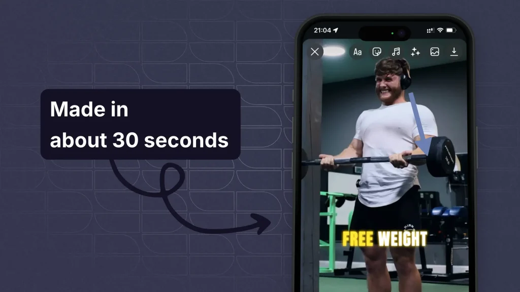
Here’s how our platform helps you choose the best fonts for your YouTube Shorts:
With SendShort, you can effortlessly create captivating YouTube Shorts that effectively communicate your ideas while maintaining a stylish and professional look through thoughtful font choices.

Choose a font that’s easy to read at a glance, especially on mobile. Simple, bold sans-serif fonts like these work well for quick readability:
Select a font that matches the tone of your content. Playful fonts can work well for entertainment, while sleek, minimal fonts are better for informative or professional Shorts.
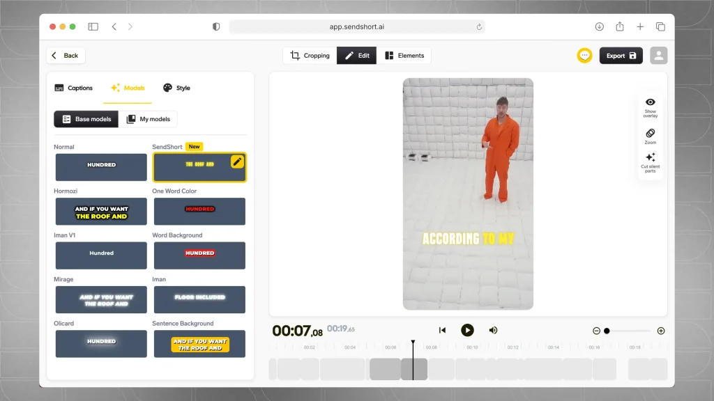
Related: Check our MrBeast’s font for captions.
Ensure your font color stands out against the video background.
Use white text with a shadow on darker backgrounds, or dark text on light backgrounds for better visibility.
Keep text size large enough to read easily on small screens. Avoid long phrases and focus on impactful words to keep viewers engaged without cluttering the video.
Using the same font style across your videos builds brand recognition. Stick to one or two fonts for a cohesive look that viewers associate with your channel.
Fonts with bold shapes work best if you plan to use animations or text effects in your Shorts, as they hold up better visually.
With these tips, you can select a font that enhances both the readability and aesthetic of your YouTube Shorts.
YouTubers commonly use sans-serif fonts like Arial, Helvetica, and Roboto for subtitles due to their clarity and readability. Other popular choices include Open Sans and Montserrat, which also enhance viewer engagement.
For instance:
Bold sans-serif fonts like Montserrat and Bebas Neue are best for Shorts and Reels, as they grab attention and enhance readability.
The best YouTube Shorts fonts for gaming are Bebas Neue and Impact for their bold and eye-catching styles.
Other great options are Oswald and pixelated fonts like Press Start 2P, which capture the energetic vibe of gaming content.
Thanks a lot for reading this,
David Ch
Head of the Editing Team at SendShort